George Tscherny passed away this week. In addition to this poignant remembrance by Steven Heller, we’re republishing this article from PRINT’s August 2014 issue.
A nondescript envelope arrives in the mail. It contains a bound black folder labeled “Influences, Inspiration and Role Models” along a gray spine, and a note: “I have been designing for over six decades without stopping … much like a cow grazes. It now seemed the time to pause and take a look in the rearview mirror.”
It comes from George Tscherny. For the uninitiated, Tscherny’s own influence runs vast, and runs deep: He’s a two-time AIGA president. He’s been inducted into the Art Directors Hall of Fame. He’s received the AIGA Medal. He taught the School of Visual Arts’ first design course, and created the SVA logo. His work has been archived or featured in permanent collections everywhere from the Milton Glaser Design Study Center and Archives to MoMA and the Library of Congress. It’s not often you get a package from a design legend. So you open it, and you publish it. Some artists inspire you to talk. But the best inspire you to listen. Tscherny falls into the latter category. — The Editors

A Lifetime of Influence, Inspiration, and Role Models
By George Tscherny
We don’t readily recognize our true role models. It’s only after we’ve found our own voice, our own vision, that sources of inspiration and influence can be acknowledged. Then comes the obligation to pass on to the next generation a body of work worth emulating.
It was apparent fairly early in my life that I had a strong visual sense as well as an aptitude for drawing, and it didn’t take long before I knew what I wanted to do with that ability. In the neighborhood where I grew up in Berlin, there was a movie theater that displayed huge hand-painted portraits of the actors featured in the current film. These portraits triggered my desire to become a “commercial artist”—a job description with which I’m still quite comfortable, despite its current lack of popularity. For just as copy can be literature, design can be art when it reaches certain levels of originality and distinction.
Growing up in a poor, working-class household, I had to find art and culture outside the home. Modern architecture, which began to appear on the streets of Berlin around 1930, captured my interest on walks through the city. A memorable example was Columbushaus by the prominent architect Erich Mendelsohn. On the street level of the building was a Woolworth’s. I remember seeing a reproduction there of Franz Marc’s painting The Large Blue Horses and thinking, What an outrageous idea—everybody knows that horses aren’t blue. It was decades before I learned who the painter was and that art need not necessarily be literal.
Economic and political circumstances prevented me from receiving formal art training, but propaganda art was all around me, most of it repugnant in form and content. There were some sane and humane voices during the Weimar Republic, such as George Grosz, John Heartfield and Käthe Kollwitz, but they were fighting a losing battle. I was much too young then to distinguish between these competing political voices, and by 1933, when I was 8 years old, the battle was over and lost.
In Berlin during the 1930s, a dominant visual presence in advertising was Ludwig Hohlwein, the most successful German poster artist between the two World Wars. Admired for his virtuosity in articulating light and shade as well as his sense of pattern, he was underestimated for his ability to focus on the essence of a message. His cigarette poster for Grathwohl is a striking example of minimalism. The glowing cigarette is the very “point” of the message.
Then came Kristallnacht, the war, and emigration. Eventful years, but not relevant to this essay, except for the welcome gift of the U.S. GI Bill for my army service in World War II, which made it possible to finally pursue my interest in art. I enrolled in the Newark School of Fine and Industrial Art, simultaneously scrambling to obtain a high school diploma so that I would be able to attend Pratt Institute in Brooklyn.
Before entering Pratt in 1947, I met Sonia, now my wife of 60+ years. What united us was our mutual interest in modern dance. In addition to being an astute and honest critic, Sonia has been a lifelong influence in guiding me intellectually and ethically by softening the edges of someone who is by nature a blue-collar designer.
At Pratt, my initial concern was with craft and technique. I saw my formal education purely as a trade and vocational school, where I pursued drawing, rendering and other skills with intensity and without concern for developing original ideas. When I eventually became interested in expressing myself creatively, I didn’t have to struggle with execution. My figure drawing became more expressionistic, and gesture became more important than detail. I had intuitively followed the advice, “First acquire an infallible technique, and then open yourself to inspiration.”
Drawing from the live figure played an important part in my curriculum at Pratt, and here the fashion illustrator Carl Erickson (Eric) exerted considerable influence. He was a remarkable draughtsman who drew with the ease that most people walk. He dominated his field from the 1920s into the ’50s. Eric’s drawing was notable for the confidence of the single line, which selectively stressed the essential and significant detail. Fashion illustration eventually lost out to photography—not to better capture detail as one might have thought, but rather to establish more contemporary moods and attitudes.
In my second year at Pratt, two professors contributed in a major way to my development as a designer. Herschel Levit was a revelation. Levit exposed us to the work of distinguished designers and to the fine arts, music and art history. This filled a gaping void, as art schools at that time offered no academic or liberal arts studies. A diploma was awarded after three years of study, much like a vocational school.
One of the graphic designers Levit introduced us to was Lester Beall, whose work I greatly admired and who, more than any other designer of that generation, became a role model. Beall integrated the European avant-garde of the 1920s and ’30s into his own distinctly American style. His skillful assemblage of photography, type, color and design elements led the way for succeeding generations of designers.
James Brooks, another key professor, taught lettering with a difference. There were two sides to the artistic personality of Brooks. On one hand there was the formal discipline required to do lettering in black and white, and on the other there was his painting, which was spontaneous and colorful. He deservedly became very prominent in the early 1950s as an abstract expressionist.
Brooks led me to the work of Imre Reiner. With exquisite sensitivity, Reiner combined traditional typography with highly personal and daring letterforms. This typographic range from cool to hot exerted a major influence on me, not only in typography but in design in general. Reiner’s skillful utilization of wood engraving showed me, as the work of Ben Shahn had done, that it was possible to blur the lines between “Fine” and “Applied” art.
It’s surprising how much I learned from journals and books. Typographie by Walter Bangerter and Walter Marti, published in Switzerland in 1948, was not only inspirational but also enlightening. It taught me that emphasis in typography is accomplished through differences in typeface or size and also through the use of color, weight and spatial manipulation.
In the 1940s (or even the ’50s) few art schools taught photography. There were no photo galleries and, with the exception of The Museum of Modern Art in New York, I found, no photography departments in museums. Magazines like LIFE, and once again books, were primary resources. Henri Cartier-Bresson demonstrated the significance of The Decisive Moment, be it in photography, design or communication. He taught us to walk softly and carry a little camera.
Although it was intended as a book on the dance of the same name, for me Martha Graham by Barbara Morgan was a photography book. Graham aficionados will be shocked to hear that I believe the actual performance never lived up to the promise of the photographs. Exquisitely printed in photogravure in 1941, these images are unsurpassed to this day in capturing the dance. The Graham book did increase my interest in the dance, which in turn led to a preoccupation with movement and capturing it on a two-dimensional surface.
Early on, a number of art historians and writers were immensely influential in refining and affirming my thoughts and attitudes, including Bernard Rudofsky ( “Are Clothes Modern? An Essay on Contemporary Apparel,” 1947), Siegfried Giedion (Mechanization Takes Command, 1948), and E.H. Gombrich (The Image and the Eye: Further Studies in the Psychology of Pictorial Representation, 1982).
An unexpected influence was the Modern Jazz Quartet.
In 1958, John Lewis recorded European Windows with the Stuttgart Symphony Orchestra. The remarkable aspect of this composition and performance is how seamlessly the music moves from a classical to a jazz mode. In doing so, it echoes in music what Imre Reiner had achieved in typography.
My association (1953–1955) with George Nelson, the visionary architect, designer and thinker, provided the most important lesson of all, which was to bring no preconceived ideas to a new project—to begin each time with a blank page. While that isn’t the most economical way to run a design office, it provides the best climate for doing creative work.
High and Low: Modern Art and Popular Culture, the 1990 MoMA exhibit by Kirk Varnedoe and Adam Gopnik, was more important as validation and confirmation of my beliefs and attitudes than as a source of inspiration. Today, as in the past, the most pervasive influence on my work is the everyday culture around me. I draw sustenance from everywhere and enjoy finding the significant in the seemingly trivial. Although my respect for high art is unequivocal, there is no question as to which side of the high/low art debate I belong. Unlike the fine artist who values only the original, I, as a commercial artist, honor the reproduction as well as its source. I find myself comfortable at the intersection of high and low art.
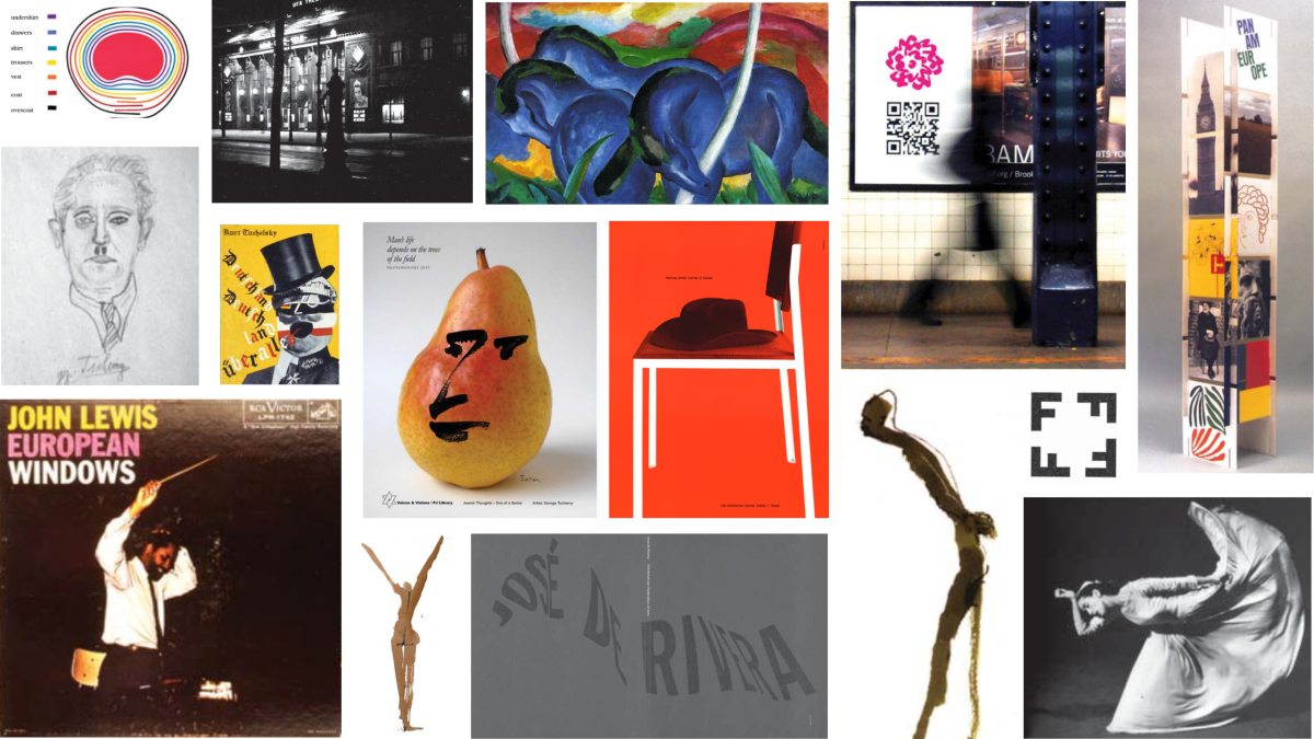
Featured in header, clockwise from top left:
1) “The seven veils of the male stomach” from Are Clothes Modern? by Bernard Rudofsky (Paul Theobald, Chicago, 1947)
2) UFA Theater circa 1930, Berlin, Moabit
3) Franz Marc, The Large Blue Horses, 1911; oil on canvas, 41 5/8 x 71 5/16”; Walker Art Center, Minneapolis
4) ”Wordless Poster,” in-situ photograph, 2012; School of Visual Arts
5) Modular display towers (one of a series), 1971; Pan American Airways
6) Martha Graham: Sixteen Dances in Photographs by Barbara Morgan (Duell, Sloan and Pearce, NY, 1941)
7) Logo suggesting floorplan (Architect Fischer) from Typographie by Walter Bangerter & Walter Marti, Switzerland, 1948
8) & 10) Quick figure studies, ink and watercolor; student work, 1949, Pratt Institute, NY
9) Exhibition catalog (front and back cover), 1961; American Federation of Arts
11) John Lewis, European Windows; RCA Victor recording, 1958
12) Portrait of George Tscherny’s father drawn from life at age 9
13) Cover and detail, Deutschland, Deutschland über alles, 1929; Kurt Tucholsky, author; John Heartfield, designer
14) Poster, 2011; Voices and Visions / PJ Library
15) Advertisement, 1955; Herman Miller Furniture Co.


