Before 89 international art dealers showcase their exquisite wares inside a building that was once the playground for New York’s rich and famous, they get the chance to be children again.
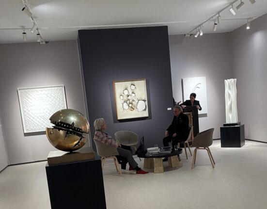
Their grown-up game? Designing strikingly unique booths out of tight uniform spaces for TEFAF New York, the European Fine Art Foundation fair at the Park Avenue Armory.
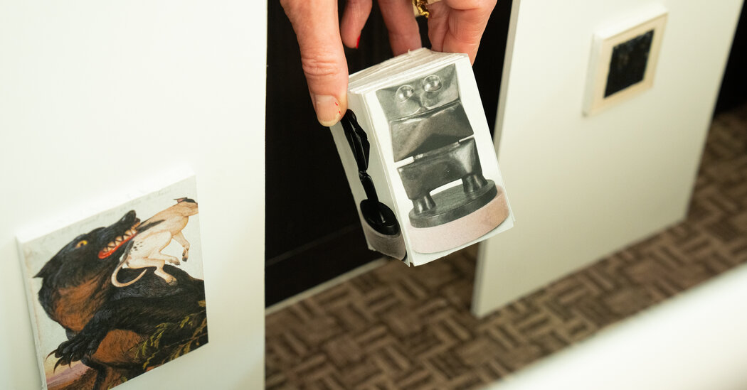
Some dealers still play with foam core models that resemble dollhouses. Others — those blessed with warehouse space — can create life-size replicas before shipping the pieces. Most in this digital age, however, tinker collaboratively inside 3-D digital structures as if they are playing video games.
Welcome to the passionately precise world of art fair design, where for gallery directors, no detail is too trivial, and every millimeter matters.
“Designing booths is one of my favorite things to do,” Evan Snyderman, a co-founder of R & Company gallery in New York, said gleefully. “It’s always been something I’ve done and to the point of almost driving my wife crazy because I’m constantly rearranging the house, moving things like one inch to the left.”
The son of Philadelphia gallery owners, Snyderman said he was already arranging his Matchbox cars in diagonal rows at 8 years old. He also placed his hand puppets on wall-mounted boxes and ordered his collection of daggers and pocketknives just so.
Now, he and his partners do it for a living.
“Like we learn in art school, presentation is everything,” said R & Company’s co-founder Zesty Meyers.
If nothing else, dealers take on TEFAF New York booths as a personal challenge.
“Honestly,” said the eponymous owner of Sean Kelly Gallery, “we all do more than enough art fairs and so one of the things that we’re always looking for is a way to kind of amuse ourselves and keep it fresh.”
About three months before the May fair, TEFAF officials email dealers booth and room assignments, and a menu of design options. Galleries choose the fabric color to cover the walls of the booths that sit under the cavernous ceiling. They also choose types of flooring, paint, electrical outlets, track lighting and temporary office furniture like storage cabinets.
The booths in the armory’s drill hall range in size from 20 square meters to 49 square meters (about 215 square feet to 527 square feet; TEFAF only provides metric measurements to its dealers). The period rooms, including three downstairs and 12 upstairs, range from about 355 to 656 square feet.
Galleries are strictly forbidden to do anything to alter these rooms that were once clubhouses for the companies belonging to the Seventh Regiment of the Armory on Park Avenue.
R & Company, which showcases historical and contemporary design, had always been tucked into the same back left corner of the drill hall until this year, when it moved upstairs. At first, Snyderman wanted to lighten the dark mahogany room equipped with 19th-century swords, shields and iron chandeliers.
Plans to hang a Katie Stout chandelier were rejected because it weighed more than 100 pounds. Although Snyderman decided to keep the interior of the room visible, he built a free-standing trellis for track lighting.
Snyderman worked twice a week together with his architect in computer sessions, starting with an anchor piece at the back of the room: a rare nearly seven-foot-tall Wendell Castle stack-laminated oak cabinet.
To draw viewers’ eyes to it, the pair created a 12-foot wall that partly blocked the windows behind it and would serve as a stage. They chose to paint it “quetzal,” a rich aqua color that serves as a uniting element for the room’s other pedestals. In their model, they incorporated Castle’s models for the sculpture, which will also be on display.
“That’s a big part of the design for us, the storytelling,” Snyderman said. He and his team went through at least six iterations of design layouts to place the other pieces in visual harmony, including a tomato red Lina Bo Bardi “Bowl Chair,” vessels by Roberto Lugo, and an Isamu Noguchi table, stool and lamp.
Kasmin Gallery, also in an upstairs period room, chose for its anchor piece Alma Allen’s 190-pound bronze moth. That needed to be reinforced onto one of the temporary walls — painted dark gray — that the dealers built inside the existing walls.
During a visit in April to the gallery in Chelsea, a smaller version of the moth was already affixed diagonally to the foam core walls of the scale model, 31 inches by 16.5 inches by 14 inches. Edith Dicconson, a co-executive director of the gallery, delighted in trying different arrangements for a Robert Motherwell painting (reduced in scale to the size of a postage stamp) and a 3-D Max Ernst sculpture.
“We come in here and all of our heads can look in like this and collaborate,” she said, adding with a kidlike cackle, “Isn’t it fun?”
Kasmin’s goal is to create an elegant but accessible space, where the works of artists who were friends and collectors of each other’s work — like William N. Copley and Les Lalanne — can be in dialogue.
What might they be whispering?
“I think they would have conversations about the style in which they would work,” said Mariska Nietzman, a Kasmin co-executive director. “But I think they also would perhaps just have cups of coffee and glasses of wine.”
Boris Vervoordt of Axel Vervoordt gallery was much more serious in discussing his digitally rendered booth, which allowed his staff across multiple time zones to try different combinations during video calls.
His gallery has occupied the same upstairs period room at the fair for about four years, in part because TEFAF respects his zero-waste policy. Recycling the same structure makes it easier to substitute new works of art, like a rarely shown 1993 painting by Kazuo Shiraga in this year’s booth.
Instead of the same space, Andrew Duncanson of Modernity gallery in Stockholm, which specializes in 20th-century Nordic furniture, lighting and jewelry, chose to move from last year’s upstairs quiet period room to the crowded drill hall.
This year, he built a mock-up of the booth in his warehouse, featuring a Carl Malmsten daybed and a showstopper of a chandelier, “Snowflake” by Paavo Tynell.
“We want to create an ambience in the room where it feels like you can move right in,” he said.
Duncanson created that atmosphere so well last year that TEFAF New York’s director, Leanne Jagtiani, said she warned him, “Don’t be surprised if you come in one morning and I’m here because I stayed overnight.”
Duncanson said that last year, TEFAF committee members told him his room design earned him an A+, even though Jagtiani said the design commendations were given in verbal rather than report card form.
For dealers, the sales ledgers are what ultimately matter.
This year, Sean Kelly will also set up in the drill hall, moving into a larger, back corner spot. It came, however, with a caveat: an immovable diagonal support wall. So Kelly and his crew made it into a room divider for three distinct views and a funnel for foot traffic.
At one entrance, a cast iron statue by Antony Gormley welcomes visitors. The anchor pieces will be any one of three large-scale works by the German photographer Candida Höfer and two paintings by the British artist Idris Khan.
A month before TEFAF, Terrill Warrenburg, art fair and special project manager at Sean Kelly Gallery, was still swapping options on the computer to see how their shapes, colors and themes interacted with one another. They also had to account for the possibility that a work could sell right before TEFAF opens, taking it off the roster.
“It is a bit like four-dimensional chess because you have all these options and you build around them and they have to play nicely together — and you keep going until you feel like you got something that clicks,” Kelly said.
He laughed, adding, “And then, inevitably, you get there and then you change it all around.”


