This article is part of series of Nautilus interviews with artists, you can read the rest here.
Artist Mark Belan is a master at grabbing attention. The scroll-stopping infographics he creates for The Visual Capitalist blog are so popular on social media, there’s a good chance you’ve seen his work before. That’s no accident. Belan, who holds master’s degrees in geochemistry, astrobiology, and biomedical communications, wants science to be fun—sexy, even.
Belan recently took a break from turning data into art to create the otherworldly illustrations for “Mirror-Image Life”, the cover story of Nautilus Issue 52. We spoke to him about his creative process, social media and art, and his thoughts on artificial intelligence.
You have a background in both science and art. When did you decide you wanted to combine your two passions into one career?
Early in my career, I had a hard time with research articles. Esoteric concepts and invisible processes were almost exclusively explained in long-format text descriptions. Having to decode and try and make sense of what I was reading made me constantly wish I had a visual resource to assist me. After years of prioritizing science before my artistic hobbies, my studies helped identify the value I could bring as an artist to my own research and the greater scientific cause.
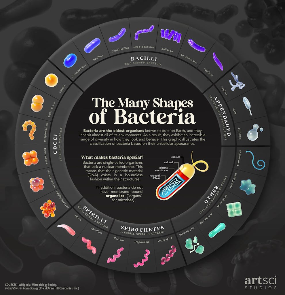
Your infographics and data visualizations pack a ton of information into a single, visually stunning image. Can you walk us through your process of transforming data into art?
Certainly! The process is challenging—I often liken it to building a bridge from opposite ends and hoping they meet in the middle. On one side is the information and data, and on the other is a strong editorial or visual “hook.” A perfect project has both sides develop smoothly, but oftentimes I have to see-saw between the data side and the art side to make things work. Preserving the accuracy of the information is the priority, but it can be frustrating when a good editorial idea has to be abandoned for the sake of informational clarity.
When you’re creating artwork to accurately communicate scientific data, is there an emotional vibe you’re also trying to get across?
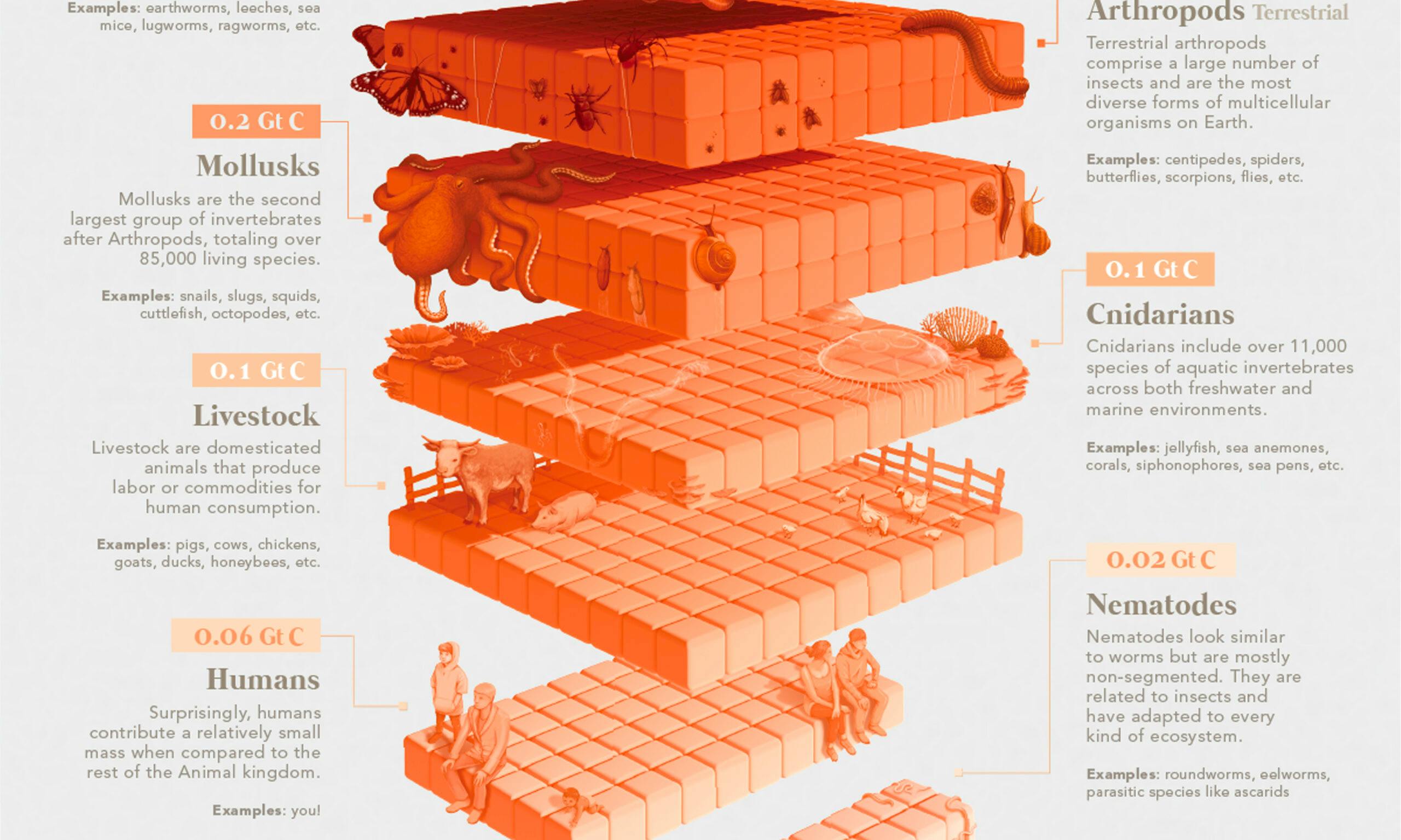
Absolutely. The visual “hook” I described is usually an emotion or vibe I want the reader to have when observing the data or information. I take a lot of visual inspiration from entertainment media, especially video games. My philosophy is that I want the science I’m reporting on to look fun or sexy, and video games are built to be that. Things like menu design, inventory layouts, and even heads-up displays make great references as they all present information and data in unique ways.
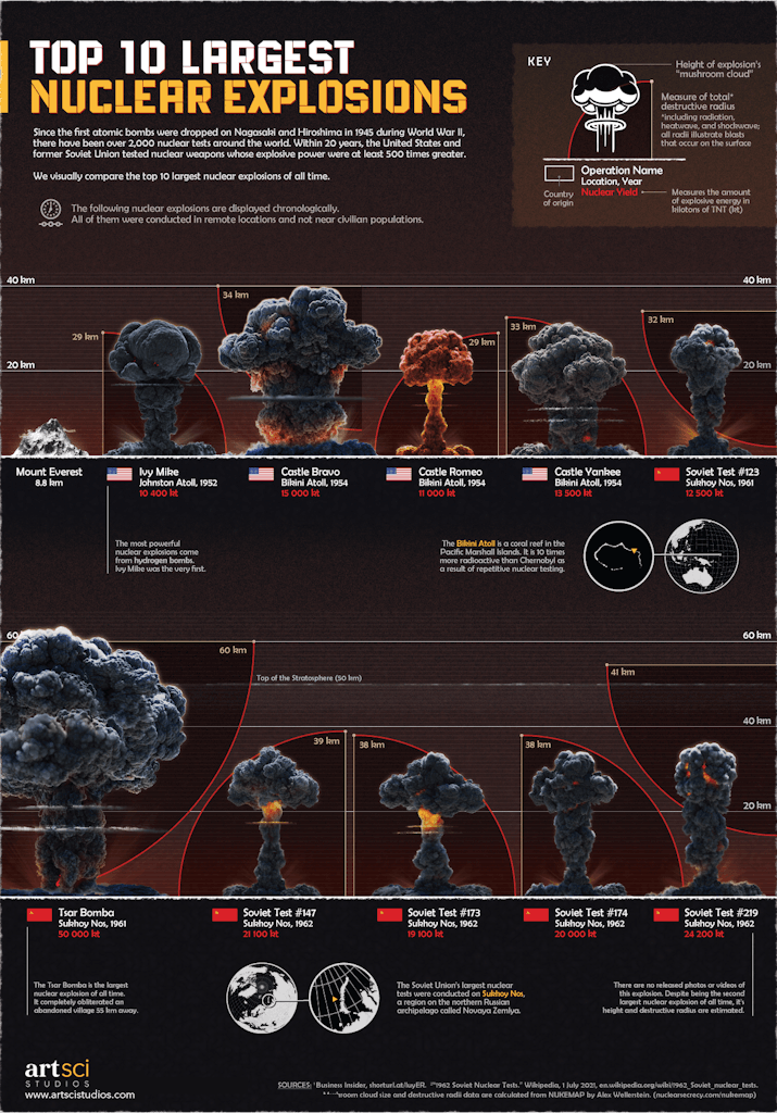
A good example is my infographic on the Top 10 Largest Nuclear Explosions. It is deliberately somber and fiery in accordance with the topic, and has a hint of a military-cross-Virtual Boy™ aesthetic.
What do you think scientists can learn from artists—and vice versa?
As an artist and visual communicator, I find I’m constantly advocating for the value of my work in the scientific space. I always say, “A picture is worth a thousand words, and sometimes a million dollars.” Research unfortunately has a dorky reputation amongst the masses, so there’s a lot of value scientists can extract from artists to counter this reputation and widely disseminate their work.
I think any artist who has the opportunity to work with a scientist should do so in order to better understand the world around them. It’s one of the greatest delights I have working with so many varied professionals; I’m constantly learning about things I normally would never think about, let alone appreciate.
In addition to the cover of Nautilus Issue 52, you created the illustrations in the cover story about “mirror-image” life. What about that story captured your imagination?
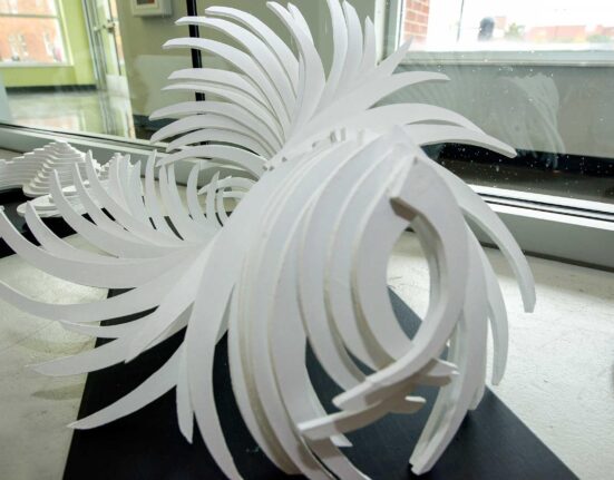
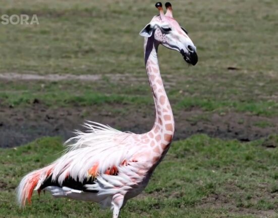
I think at the core of this story is a distinct sci-fi element that can tickle the imagination of many readers. I explored mirroring biodiversity without being too realistic or literal in its presentation in order to give room for a little imagination, much like the written article does. I took inspiration from Hieronymus Bosch’s “Garden of Earthly Delights” and produced my version of “mirrored life” in a highly-stylized way. I hope it prompts readers to imagine their own vision of what “mirrored life” could look like.
Your cover art and illustrations are something of a departure from your data visualization work. How does your creative process change when you’re not constrained by data?
Thank you for pointing that out! It’s true that my work can sometimes vary along a spectrum. For projects like cover art my creative process tends to lean toward the expressive side of things where I try to farm an impression from the viewer. This allows me to explore my illustration skills in a more playful and relaxed manner.
This privilege doesn’t always exist in data visualization where sometimes one needs to be as unbiased and clinical as possible, so it’s a welcomed opportunity when I get to stray away from that. I’m really grateful that I have clients who trust me to visualize their projects in both of these ways.
Infographics have gained some popularity on platforms like Instagram—has social media had any effect on your style?
The only impact social media has had on my style is how I design for mobile platforms. This is quite frustrating as a designer, since some of my ideas are relinquished to the very rigid and limiting dimensions required for mobile reading. I’m constantly looking for excuses to break this, though, so you’ll find that my work is sometimes reformatted to fit posters or other dimensions, which is more creatively liberating and satisfying.
Unfortunately, social media can also be a vector for misleading or sloppy infographics. Do you have any data visualization pet peeves?
Data visualization is becoming increasingly acknowledged and studied, so I am confident that people will continue to hone their visualization practices over time. My pet peeves come more so from when design theory is absent in presenting data. Our world is inundated with massive amounts of data and greater demands to interpret it, so I’d like to see more data visualizers pick up design theory and amplify their storytelling in creative ways.
I’m a strong advocate for the idea of “narrative load,” where we can use “extra” graphical elements to help support the data’s narrative. For example, it makes sense that an infographic about night-time data could be produced in a dark color palette, but when design choices disregard playing into this, it neglects the potential to make the experience fun, interesting, or even memorable.
The rise of generative AI services like Midjourney is causing some controversy in the art world. What are your thoughts on the use of AI to create art?
There is nothing “art” about imitation software. It saddens me that professional artists have repeatedly been undervalued and abused, especially in the commercial space, throughout history. With AI, this abuse continues in the form of violating intellectual copyright and replacing jobs. AI is an exciting but inevitable development, so I welcome a future with AI if it can support artists, like improving their workflows or simplifying tedious aspects of design software.
Artists are not obstacles that need to be removed. The stories we tell with visual art come from people, not machines. Human contribution is essential to genuine, meaningful creativity, and I believe we should continue to support that.
If you had an infinite budget, what would your absolute dream project be?
It’s been on my mind lately how the last ingredient of fulfillment is giving back to others, and so my most desired project is to expand my practice into a full-time production studio. This industry is still quite niche and underrepresented, so fostering a workplace where people can indulge in their “sci-art” passions in the way that I have feels like a tall order.
Of course, an infinite budget would do wonders for both undergoing and sustaining this kind of expansion, especially if it lets us populate some of my favorite scientific spaces in the world with the brand of work I currently do. In some ways you could interpret that as taking over the world, but I’m more so interested in it for the sake of making science globally palatable, understandable, and ultimately appreciated. Having other people who share this passion and vision come along for the ride would be a wonderful and meaningful accomplishment.
Interview by Jake Currie.
Lead image courtesy of Mark Belan.

