The learning never stops for a creative. Experience builds and so, too, does the opportunity to investigate new approaches and ways of thinking about one’s work. In turn, there is always a chance to see creative process from new perspectives and learn from one’s fellow artists. The Gnomon Workshop provides a space for these encounters to flourish.
I meet with several Gnomon artists and workshop instructors to discusses process and aesthetics; these are leading artists working today in video games, film and illustration, namely Pascal Blanch, Andy Park, Hamish Frater and Rembert Montald. Each artist addresses the issues of style, technology and technique.
Whether you want to master ZBrush or learn character design in Photoshop, these artists have you covered. Visit The Gnomon Workshop website for more on this training resource; subscribe to learn core and advanced techniques from leading artists working in video games, film and animation.
Artist insights: Pascal Blanché
How masters from the 1970s and 80s continue to influence the work of this issue’s cover artist.
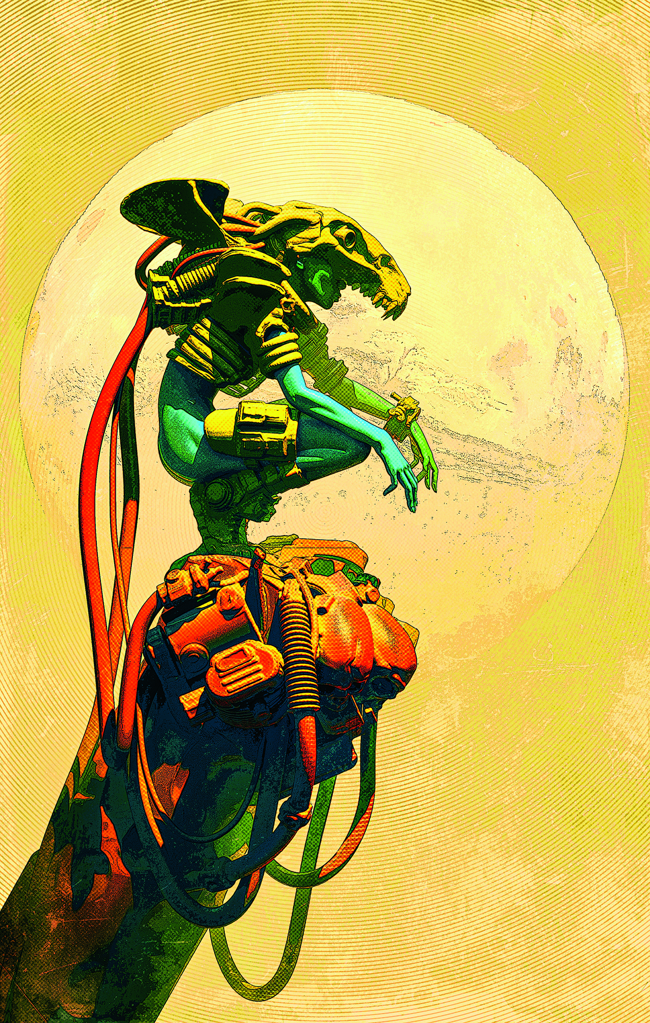
Of his image Bird of Prey, created for The Gnomon Workshop, Pascal explains: “Bird of Prey is an illustration I created for a tutorial using 3ds Max, ZBrush, KeyShot and Photoshop. My work is typically an homage to sci-fi covers and artists from the 70s and 80s. I like to take the influences of the masters from those days, artists like Moebius, Frazetta, Corben, and Druillet, and apply a slightly modern take using digital tools.
“I enjoy blending elements of fantasy and sci-fi to create a style all of my own. At heart, I’m more of a sculptor than a painter, and all my work is created with 3D tools. It’s then textured and rendered before being touched up in Photoshop. I use a mix of 3D objects to compose the main elements of my subjects in 3ds Max.
I enjoy blending elements of fantasy and sci-fi to create a style all of my own
Pascal Blanché
This technique is generally used to create kit-bashed models, and from my perspective, it’s a great way to approach design. “Every model has its own constraints, and when kit-bashing, I always find interesting new silhouettes
I wouldn’t have thought of otherwise. It’s like 2D custom brush techniques; but applied to 3D. When it comes to ZBrush, it’s pure sculpting. And KeyShot is my favourite rendering tool, mostly for the speed and the different layers that I can extrapolate from the composition.”
Of his use of colour, Pascal explains that his key rule is ‘no white, no grey.’ “All shades of the illustration are carefully separated, recoloured and composited in Photoshop. I reuse multiple passes from the render, including the Z-depth and even the Normal pass, to create masks that allow me to control the final look.”

Artist insights: Hamish Frater
The art director and instructor explains the challenges of correctly placing mech creations in his compositions.
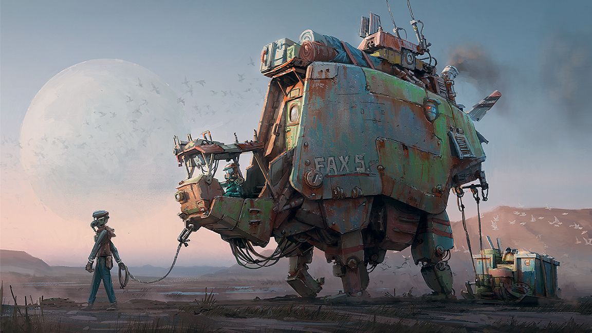
For his image Pack Horse Pass, Hamish Frater notes: “The image was made for my video tutorial: Mech Illustration with Story and Character. It depicts a caravan of merchants passing through a small settlement in a post-apocalyptic world.”
He then defines the through-line of his workshop process. “The workshop covers the full creation process for the image, from initial ideation, reference gathering, and sketching through to the final colour painting and finishing touches in Photoshop,” he adds.
“I generally use 3D as a base for my paintings, and the workshop covers how best to combine the flexibility a 3D package gives you with the more expressive and textural look you can achieve from freehand painting in Photoshop. Each chapter begins with a short lesson relevant to that stage of the pipeline, then we put that lesson to use creating the final image.”
Using colour and contrast
Hamish Frater identifies the process he follows for creating the satisfactory final touches to his images.
“I love putting detail into an image but always have to remind myself to keep it to the focal points. This includes colour, too; your most saturated and contrasting colours should appear where you want people to look.
”It’s good to have a plan from the beginning and keep it simple until you get confident with colour. I decided on a simple complementary scheme.
”The environment reference I liked had a red tone to the desert sand, so I complemented this with the green tones you on the mechs and the settlement pieces.”
Hamish then turns his attention to lighting in an image, emphasising: “This is a great chance to harmonise the colours and bring out the mood. I further emphasised the reds in the environment, lighting them with a warm early evening sun spilling into the scene. I held off going too blue in the shadows; I wanted a slow, relaxed mood, so I kept a lot of colour contrast out of the lighting.”
A notable dynamic in Hamish’s work is his atmospheric perspective. He explains: “I love creating depth in an image, and the low-angle sun cutting through the layers of the atmosphere helps with this. You can emphasise the atmospheric perspective, lowering the contrast of distant objects and letting the haze of the atmosphere take over.”
Of the fundamental compositional issues found in Pack Horse Pass, Hamish says: “Getting tall, vertically proportioned mechs to fit nicely in a 16:9 horizontal image wasn’t easy. In this chapter, I do a few contrasting composition roughs in 3D and eventually decide to go with what we see here. A close-up foreground mech spills out of the shot and acts as a divider, breaking it into smaller, more manageable chunks.”
Artist insights: Andy Park
Why small details make a huge impact when designing superheroes’ costumes.
Gnomon Workshop instructor Andy Park discusses his image The Goddess of War, and begins by noting: “When designing comic book characters for the Marvel Cinematic Universe, I’m thinking about bringing reality to their look that, traditionally in comics, is taken for granted. It’s accepted that a superhero wearing tights running around is normal and is nothing out of the ordinary; or that their outfit would be impractical for what they need to do as heroes.
“But the challenge in live-action is that the acceptance barometer is much steeper than that. We try to answer the ‘why?’ when it comes to why they would wear what they wear. It’s our attempt to bring believability to these unbelievable heroes.”
Andy then shifts his attention to the process of detailing. He explains: “With the need to create a reality to the looks of these heroes and villains comes the importance of describing the details of their costumes, which include their clothing, accessories, helmets, and any other elements that complete the look of the character, including the look of their powers and effects. Rendering materials properly is of utmost importance. This is where reference is paramount.
Different sheens on fabrics and hard-surface materials tell a story about what a character is wearing, and why they’re wearing it
Andy Park
“When designing costumes, it’s important to be able to communicate the look of different materials and fabrics. Patterns and textures help define the look and feel of so many aspects of costumes. Different sheens on fabrics and hard-surface materials tell a particular story about what a character is wearing, and why they’re wearing it. Therefore, the need to render these things accurately is incredibly important.”
Of his overarching process, Andy notes: “To create my concept designs, I primarily paint using Photoshop. But I also utilise 3D programs such as ZBrush and KeyShot. For reference, I will almost always use photography. In this line of work, an emphasis on reference can’t be stressed enough. For live-action, it’s all about trying to convey realism to the director and producers. They need to know what the character will look like, and the more you can close that gap from their imagination to what it can and will look like on film, the better.”
Artist insights: Rembert Montald
A library of references and finding a connection with his scenes is a vital part of the process for the artist.
“I always try to imagine myself in the shot,” explains storyboard and concept artist Rembert Montald. “I ask myself questions: How do I feel? What would I do in this situation? If it’s an action shot, I look at references from various films, and I try to pull moves from them.
Using your influences
Rembert Montald reveals the influences that sit behind his art and its subjects.
“Some masters of lines I admire are Ivor Hele and Gil Elvgren, particularly his charcoal drawings. I’ve been using digital-only for my work, so it became work. While traditional feels more like meditation to me. I also draw subjects that are dear to my heart and my surroundings. I cannot explain the joy that good drawing gives me.”
“So, on my first day after receiving a script, I’m mainly searching for, and gathering, references. The same goes for emotional beats. I’ve generated an entire library of movie stills over the years that I can search through for expression references.”
Of his use of monochrome, Rembert explains: “The monochrome pictures I draw are intended to add colour to the drawings. When I use them, they are fairly desaturated; this can elevate the image because most of what we see with our eyes is fairly desaturated. Nowadays you can have hot pink and other neon colours.
“As for more colourful images, I would almost completely eliminate the line work since it would dilute the pigment. If there is an elevated moment in the story, it would be a downer to have desaturated colours. Ultimately, the story will dictate to everyone involved what it needs.”
This content originally appeared in Imagine FX. Subscribe to the magazine at Magazines Direct.

