It doesn’t matter how rich or famous you are. If you work in British TV, there’s one thing you crave, and that money can’t buy. A TV award from BAFTA (British Academy of Film and Television Arts) confers a status, recognition, and validation that’s right up there with an Emmy. Quite simply, everyone in the industry wants one.
You immediately get a sense of this, whether you’re chatting with a celebrity in person or watching them rib each other about their BAFTAs (or lack thereof) on chat shows. But it’s easy to forget that BAFTAs aren’t just for the actor, presenter or comedian who fronts a production. They’re also a tribute to the myriad of hard-working, usually invisible, production staff on the other side of the camera, who are crucial for making our favourite programmes so great.
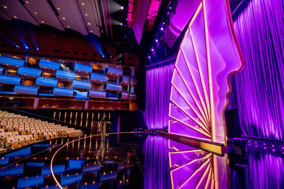
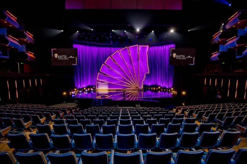
So we love the fact that the spectacular 8m high installation that framed the 2024 BAFTA TV Awards, hosted by Rob Beckett and Romesh Ranganathan, was inspired by and paid tribute to just those creatives. We were excited to chat with renowned production designer Julio Himede to find out how he conceived and created it.
Bringing Julio to BAFTA
Luring Julio and his New York-based Yellow Studio to BAFTA for the 2024 awards season was, quite frankly, a bit of a coup. One of the world’s leading production designers for TV and staged events, working between the US and Australia, he’s previously lent his talents to global spectacles, including the Grammy Awards
and the Eurovision Song Contest.
At the same time, the commission held deep personal resonance for Julio, who is Latin and was born in El Salvador but grew up in Australia and trained in Sydney before moving to New York in 2014.
“Growing up in Australia, I can relate a lot to how the British work,” he reflects. “So it’s almost like coming home and being connected when I work in England.” This affinity for UK culture ensured his work would be a respectful yet bold tribute to BAFTA’s storied legacy.

© Richard Murgatroyd
© Richard Murgatroyd
© Richard Murgatroyd
Yellow Studio’s first creation for the institution appeared in February at the BAFTA Film Awards. This stunning 8m tall installation brought together 12 golden silhouettes in the shape of the BAFTA mask, arranged in a semi-circle to create a sense of motion and animation. The design was inspired by early animation devices like the zoetrope and paid tribute to the fundamentals of filmmaking: progression, movement, lighting and illusion.
Then came the BAFTA TV Awards this May. For this event, Yellow Studio’s initial brief was open-ended: to create an installation celebrating what it means to win one of those coveted BAFTA masks. (First designed in 1955 by US sculptor Mitzi Cunliffe, the BAFTA mask has since become key to the Awards’ branding and ethos.)
Yellow Studio spent around six weeks working closely with the organisers to find a way to capture the magic and collaborative spirit of television. Gradually, a central concept emerged: to honour not just the famous faces on screen but the entire production team whose efforts bring the vision to life.
Celebrating everyone
“We wanted to celebrate all parts of the production,” Himede explains, “from the person creating the graphics to the director, producer, production designer, line producer, as well as the actors and actresses you see on camera.”
To manifest this idea, his team configured eight monumental mask silhouettes into a sculptural, cascading form, each one seeming to tumble into the next in a flowing sense of motion.
In addition to recycling as much from the BAFTA Film Awards installation as possible, the materials had to be carefully considered to achieve the desired minimalist yet impactful aesthetic. A sturdy steel framework was cloaked in sheer, semi-translucent fabric panels that shimmered under the lights. “It gives a sparkle and shine, but it’s also fire-retardant as required,” Himede explains. Integrated into this fabric were channels for LED lights that could transform the entire sculpture into a dynamic, colour-shifting element.
© Richard Murgatroyd
© Richard Murgatroyd
© Richard Murgatroyd
For me, this was the key to unlocking the magic of the ceremony. Even the edited version of the awards (which UK viewers can still watch on the BBC iPlayer), runs for just over two hours, which is a long old time. And most of what you’re seeing takes place on a single stage. Yet the dramatic way the installation changes under different shades and colours of light means that it never looks the same twice in a single shot, helping to keep the scene visually interesting and stimulating.
And that was no accident. “I always say our designs don’t really come alive until the lighting is switched on,” explains Julio. “It’s what makes a flat piece of scenery become three-dimensional.” Working with their lighting designer, Tim Routledge, the team programmed around ten different lighting looks that could transition throughout the ceremony and added a couple more on the day itself. In situ, these lent an ethereal, almost phantasmic quality to the masks’ flowing silhouettes.
TV vs live audience
Even on the small screen, the impact of the installation was spellbinding. “Most of the time, you don’t see the whole thing; you only see glimpses,” Himede notes. “But we wanted those glimpses to be constantly entertaining for the audience at home.”
However, while television viewers were the primary audience, Julio also had a live audience in mind. “It has to feel elegant to the live audience without seeing clunky set changes,” the designer describes. Again, this was where the lighting choreography – a series of gradual, seamless transformations – really paid off, providing the audience with an ethereal, ever-evolving environment to enjoy throughout the ceremony.
© Richard Murgatroyd
© Richard Murgatroyd
© Richard Murgatroyd
Julio adds that the theatre’s soaring vertical space perfectly suited this dynamic. “It’s a wonderful space: a fantastic wood interior with a lot of height, so we wanted to take advantage of that and create something really beautiful,” he explains.
Symbolic appeal
But the success of this installation wasn’t just about sheer visual splendour. For me, its greatest accomplishment was its evocation of something higher: a symbolic embodiment of television’s power to transport and captivate.
“When we design these big shows, our mission is to create a playground for the artists, so they can be having fun and give that energy to the audience,” he explains. And on that May evening, the BAFTA nominees and guests were indeed transported to a fanciful realm where art, entertainment and technology united in full grandeur.
As the industry’s top talent celebrated another year of Britain’s finest television, Yellow Studio’s piece paid tribute to the essence of the medium itself. With ingenuity and heart, it honoured the multifaceted teams of creatives who conjure new worlds before our eyes. And it reminded us that, at its core, TV remains an orchestra of human collaboration.
And that’s not just a professional achievement but a personal one for Julio. “We’ve been working in the UK for the last six years,” he explains. “So we’ve got to know a lot of crew, a lot of producers and directors. And even though it’s a big industry when it comes down to it, it’s a small pool of people. So it’s like family to me, which is wonderful.”

