
Be sure to cast your votes in the poll below; but first, let’s check out the box art designs themselves.
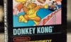
North America
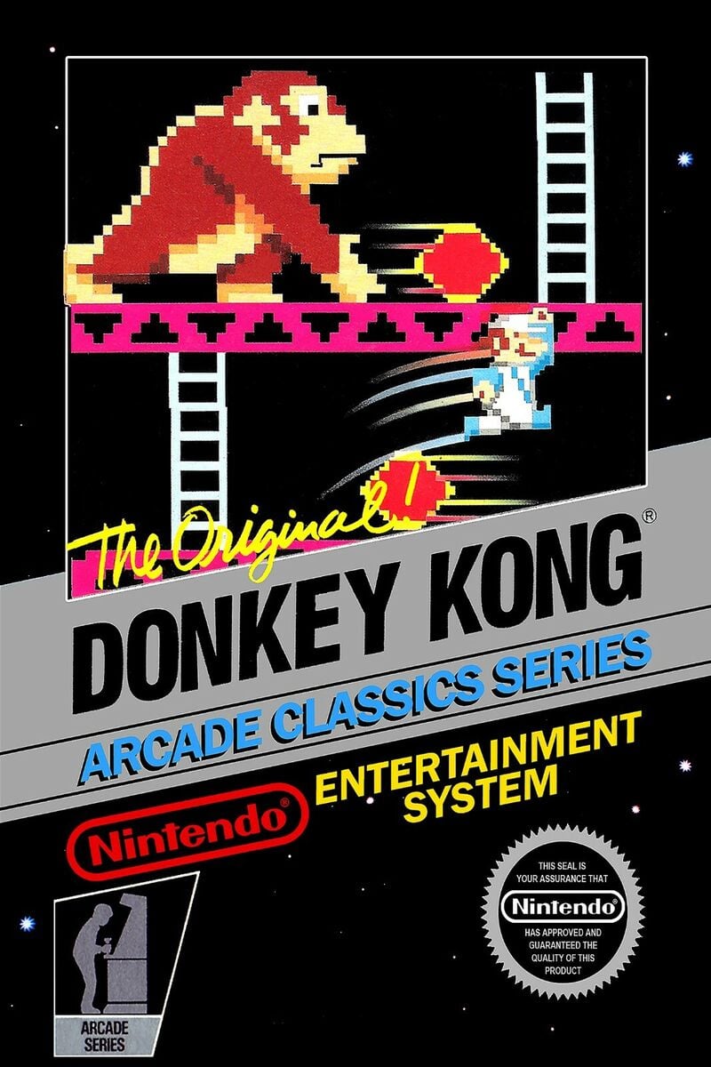
The release in North America depicts what is arguably the closest representation of what the game actually looks like on-screen. You’ve got sprites of both Mario and Donkey Kong, along with the classic pink platforms and white ladders against a jet-black background. It’s iconic and it simply works. Wonderful stuff.
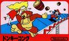
Japan
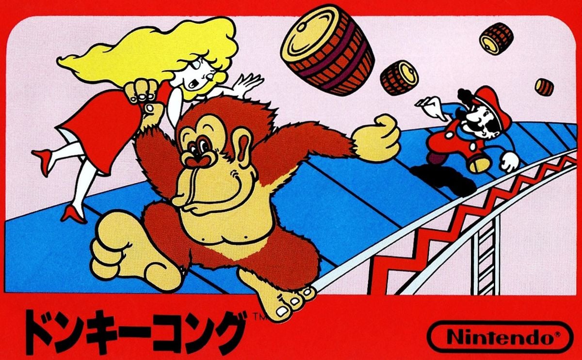
Japan’s release opted for a quirky illustration for its own cover, showcasing Mario chucking a barrel at the dastardly Donkey Kong, who just so happens to have poor Pauline in his grasp. It’s a simple piece, but that’s kind of the reason we love it so much..? It’s just such a bold piece that’s instantly recognisable.
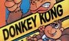
Europe
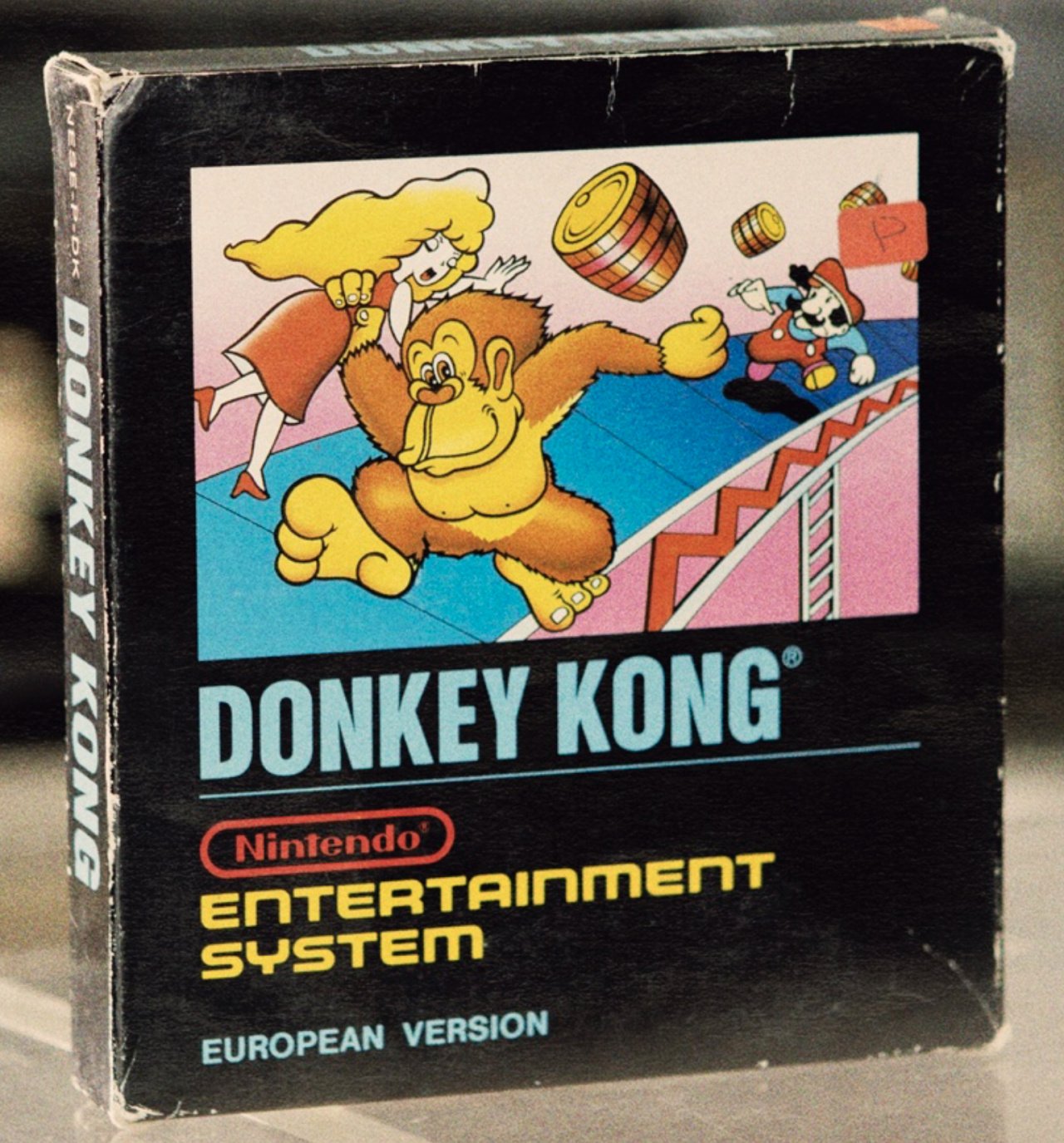
Europe’s cover uses the same illustration from Japan, but compacts it slightly to include more information; obvious stuff, you know, like the name of the game and the hardware system itself. Really, the illustration itself does most of the leg work here, but we do like the overall composition.
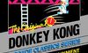
Bonus
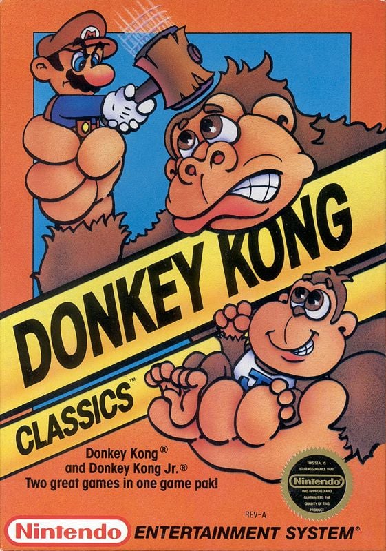
So as mentioned, we had to include Donkey Kong Classics because just look at it; it’s so adorable. It showcases Donkey Kong himself carrying both his son, Donkey Kong Jr., and his nemesis Jumpman, the latter of which is bopping Donkey Kong on the head with a hammer. It’s just a lovely little piece.

Thanks for voting! We’ll see you next time for another round of the Box Art Brawl.