Graphic designers, illustrators, type designers, animators, in-house creatives, and solo practitioners, your work deserves the spotlight! With PRINT New Visual Artists (NVA) awards, we’re on a mission to discover tomorrow’s design leaders today. Since its inception in 1998 as PRINT’s 20 Under 30 shortlist, the NVA alum roster reads like a who’s who of design superstardom, featuring Eddie Opara, Alan Dye, Jessica Hische, and Zipeng Zhu.
No matter what you create, where you studied, or where you work, a brilliant portfolio is your ticket to being seen by a massive global audience of art directors, hiring managers, conference organizers, and other key decision-makers. The NVAs have a track record of transforming careers, and we’re more committed than ever to uncovering and celebrating the brightest talents in the industry.
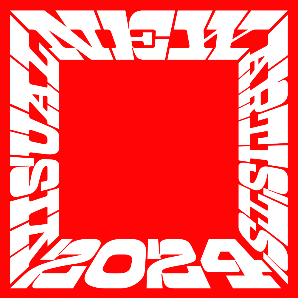
PRINT tapped acclaimed design studio COLLINS to craft the visual identity for the NVA 2024 relaunch. COLLINS is known for groundbreaking work, consistently pushing the boundaries of creativity and branding, and the team has poured their expertise into making the NVAs visually unforgettable. Their design encapsulates the spirit of excellence that NVA stands for, ensuring that this year’s showcase celebrates design’s emerging talent, the history of the NVAs, and a visual feast for the global design community.
To explore the new identity, I asked COLLINS designers Nicole Cousins (pictured left) and Jaeyou Chung (right) to frame their work process. Their responses are below.
What was the initial concept for the New Visual Artists (NVA) identity? What primary sources of inspiration shaped your design approach?
Nicole Cousins: I had a simple thought to use a frame as an identity and a graphic language. As a team, everyone found this approach intriguing right away. I wanted to visualize honoring new people and new voices within the identity with a logotype that would not just speak to the experience but also embody the experience of that achievement.
Jaeyou Chung: Historically, painting and frame design have been closely related. As painting techniques and styles evolved over generations, so did frames, always reflecting the period’s artistic, cultural, and technological changes. Frames evolved from being functional, protective devices to becoming essential elements of artistic expression, enhancing and complementing the artwork they encased. More importantly, a frame represents the ultimate form of creative service, channeling its own artistic intent to highlight someone else’s. This reflects the mission of the NVAs, which exists to honor and showcase the creativity of others.

The NVA identity features distinct visual elements and typography. How do these design choices reflect the essence of the awards?
JC: Yes. We hope our identity embraces other people’s work. We controlled the negative spaces to work as a holding device with letterforms to maintain a clear, defining structure. Borrowing gestures from 19th-century wood typography and Tuscan typographic forms of the past while incorporating contemporary characteristics in the super-thick slab serifs, we created a system that holds both the past and future of visual arts. The horizontal and vertical bars of the slab are essential to this system. The typography features highly contrasting strokes that shift according to different frame sizes, hopefully reflecting NVA’s ability to adapt to its surrounding content.
What were some of the challenges you faced during the creative process for the NVAs, and how did you overcome them?
JC: One challenge in crafting something like this is ensuring the scalability of the typographic structure. We wanted to highlight the work in the middle, so the typography needed to be less prominent, allowing the artwork to take center stage. The flip side was the NVA identity also had to be instantly recognizable and enduring. I hope we were able to reconcile that tension. To overcome this, we tested many scales to achieve readability without overshadowing the artwork. A slab face with severe horizontal and vertical bars helps maintain its structure. We pull colors from the artwork to create harmony.
How did COLLINS’ design ethos and philosophy influence your branding work for the NVAs?
NC: At COLLINS, we view design not as what we make but as what we make possible—where design is a means to build bridges to new, more desirable futures. To peer around the corner in search of what could be, we start every project in our library, where we have over 5,500 volumes. We’ve found that by rooting ourselves in history, we always seem to find someone, somewhere, who’s solved a similar version of the problem we’re facing at that time. It helps.
JC: Our approach was integral to the NVAs project. We combined historical typographic gestures with more timely ones to create adaptability. Our ethos always emphasizes honoring the past while envisioning the future, ensuring that our work is rooted in tradition to bring familiarity and reassurance, yet forward-thinking enough to bring originality and surprise.
How did the NVA identity evolve from the initial sketches to the final product?
JC: The identity evolved significantly from our initial sketches. Throughout, we paid keen attention to all the details in the letterforms. We also recognized the importance of this identity becoming tangible, physical, and dimensional. So, we envisioned the logotype as a real trophy, determining the dimensions, proportions, weight, and materials that would work best in a real-life object.
BOTH: It was exciting to imagine our symbol as a heroic, heavy trophy, embodying NVA’s mission to support emerging voices. We want to see it standing proudly on someone’s desk 15 years from now while they share a story on why winning recognition was important. Considering the remarkable promise we see in a program like PRINT New Visual Artists, it’s certainly important to us. We could not be more honored to be invited to design the identity for the NVAs. We can’t wait to see how our work will showcase the first 2024 New Visual Artist.